A celebration of land and sea: An ammonite tells the story of the past and present of The Maltings
Every story has to start somewhere. The story of The Maltings’ logo began early in 2024 as the restoration of the building was moving into its final stages.
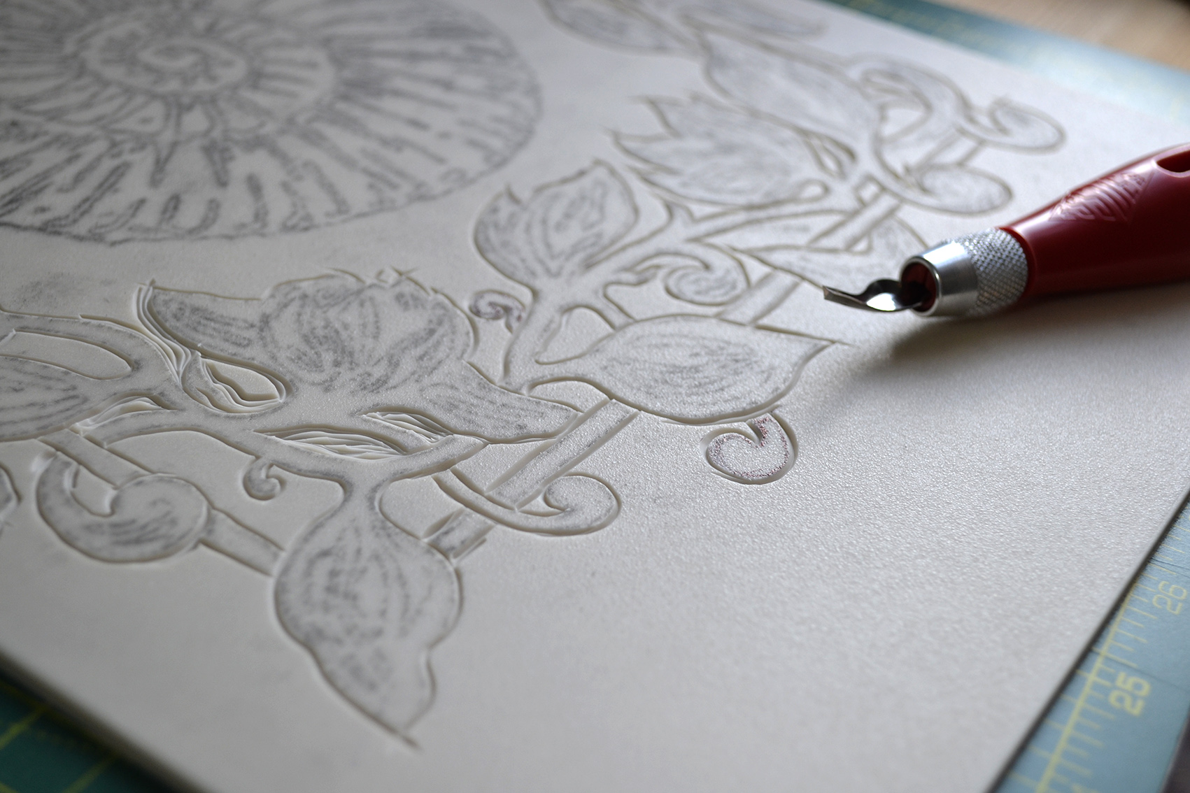
“If you look closely at The Maltings logo you will see an ammonite at the centre, surrounded by a frame at the top, and some foliage at the base. It might seem a random collection. None of this came about by chance.”
“If you look closely at The Maltings logo you will see an ammonite at the centre, surrounded by a frame at the top, and some foliage at the base. It might seem a random collection. None of this came about by chance.”
Every story has to start somewhere. The story of The Maltings’ logo began early in 2024 as the restoration of the building was moving into its final stages. The brief to the brand and design team was deceptively simple: to come up with something that was distinctive and could be used across multiple assets (from aprons through to business cards and the website).
Of course there is nothing simple about the creation of a logo. It has to work hard to connect your brand (in our case, The Maltings and The Grain Store restaurant) with a diverse audience. It has to be a shorthand for the brand and everything it stands for (excellence, trust, friendliness). It has to stand out. It has to be adopted quickly so it feels as though it has been around for a long time. It also has to tell a story.
Bringing the ammonite to life
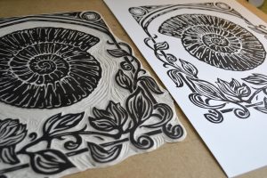
If you look closely at The Maltings logo you will see an ammonite at the centre, surrounded by a frame at the top, and some foliage at the base. It might seem a random collection. None of this came about by chance.
The design team started out by looking at the history of The Maltings. As its name suggests it was once a building where grain – often barley – was converted into malt for use in the brewing industry. In more recent times the main house was a hotel, whilst the Grain Store with its awe-inspiring double-height ceiling was used as an artist’s studio.
Since so much about The Maltings is about the destination and – once there – a sense of place, the design team also looked at the surrounding area for inspiration.
The short-list of elements that could make up the final logo and inform the entire brand and design execution and roll-out, included: the ammonite (providing a link to the past, to the coastline, and the famous fossil beaches of North Norfolk); an artist’s easel; the frame of the main doorway; native birds, butterflies, and flora such as seawort, and of course barley.
The decision was to show land and sea: the ammonite became the hero, framed by a mixture of the artist’s easel and the doorway, and a selection of local flora. The design team produced initial sketches and then worked with an artist they knew to create the final logo.
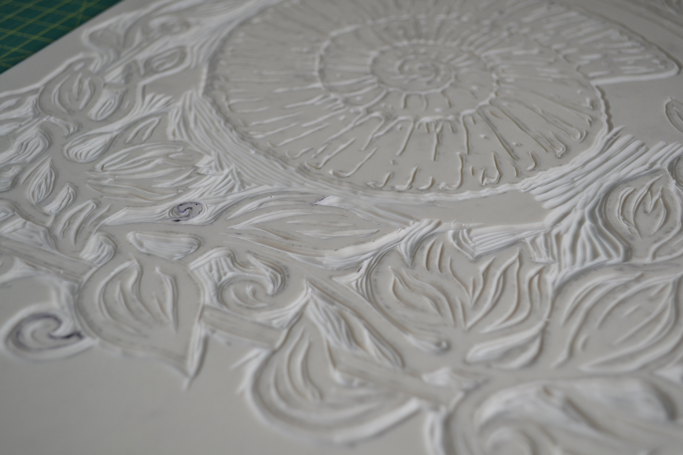
Alex Ebdon is known for his linocut drawings. With a guiding philosophy to ‘capture the moment’ he was the ideal artist to work on The Maltings logo and help transform the idea into a workable reality. He started out with sketches before carving and inking the design and producing the final version.
You can now see the logo across all our assets.
